Thursday, 16 May 2013

250 word description and titles for project Recapturing the Real

Recapturing the Real

Recapturing the Real deals with memory and photography verisimilitude and challenges misrepresentations of the photograph through memory revival. Often in photographs people provide a false representation of their true selves in order to portray themselves positively and thus fit in with society. The smile is an example of this as it continuously masks the true emotions and feelings that are felt at the time, and this performance of happiness may even completely contrast with the subjects emotions during the brief and ephemeral photographic shot. This exhibition is self-reflexive and interrogative; offering the idea that a memory relived can portray more sincerity and truth than that of its photographic counterpart which was taken at the time.

Providing an insight into the lives of my mother, brother and partner, this project highlights the extent to which we, as a society, will go to avoid being represented negatively. However, questions are also raised throughout regarding erroneous memory recall and whether a photograph's existence alters the memory of a certain point in ones life, or the discussion of this time can fracture the truth and spawn dis-realities. 

Inspirations from this project derive from the memory-based reenactment projects of Irina Werning who stages photographs of people to be consistent with a photograph of them from many years before, evoking the idea of memory reminiscing. The focus on close relationships and people within their personal spheres, in this exhibition, was also inspired by photographers such as Michelle Sank and Tina Barney - who documented her family in their homes, resulting in candid, although staged, insights into personal and wealthy environments. This exhibition will appeal to anyone who is intrigued by the human psyche and condition.


1. Dave's Memory Opposites


2. Dave's Rest and (memory) Revival 


3. Djordje's Reality


4. Djordje and the Dragon


5. Anne's Bittersweet Memories


6. Anne's Motherhood Memories


Tuesday, 14 May 2013

Editing and my Final Selection

The following 6 photographs are the unedited images which I will use in my project:


I did consider asking one subject what colour they would associate with their true memory with and tried to highlight this aesthetically in terms of editing. This was before I had chosen my final images. I edited the following photograph of my boyfriend to appear dark green:


I really liked this aesthetic, especially as bright vivid light and colour on the right could have connoted new beginnings of some sort or the happiness of his current life, intertwined with the sense of darkness and foreboding he feels when reliving his memory. I also liked the dream like aspect of the photograph attained due to the distant reverie in his expression and the clarity setting which I heightened to attain a sharp contrasty feel, making Djordje really stand out to the viewer. However I felt that this photograph wasn't as good at conveying the truth of the memory as well as the other one and I felt that a Black and White aesthetic would underline the ideas of memory truths and distant pasts better, whilst simultaneously tying all the photographs together succinctly. I greatly enjoyed using the clarity tool to sharpen detail in the face of all subjects and portray the physicality of time passing. I edited highlights and contrasts to bring some of the photo's to life a bit more and added shadows as I found that this often brought out eye colour and thus heightens engagement, and effects a uniformity in my photo's as a set. I understand that they differ slightly (i.e. as Djordje's close up is not against a white wall, and he doesn't share an intra-diegetic gaze with the camera/viewer) but, upon seeing many sets of photographs at the V & A and from my online research I understand the photography allows for creative freedom and it is the significance of the point above the aesthetic which is of greatest importance. I noted that the works of people like Nan Goldin , although had overt themes running through them, could be slightly or even greatly different in terms of their aesthetic.

I think all of these photographs stand alone in their own right as they all communicate something to the audience, yet encourage the viewer to build their own ideological, sociological and psychological thoughts into the photograph, thus portraying further distortion and fracturing of memories every time that they are told or represented.

These are my final selection:


Wednesday, 8 May 2013

3rd and Final Shoot

I have used the Nikon D700 for the following photo's. The lenses in the D700 have a much smaller depth of field, capturing detail much more sharply than the D7000 is able to. It is therefore brilliant at focusing on one object, however I found it hard to focus on both the photograph and my brother David in these shots. This is okay, however, as I did intend for the photographs to be somewhat blurred out in comparison to the truthful expression. I am largely happy with how these have turned out therefore and am happy to start editing.


I think this photograph is my favourite as David looks quite excited and happy but it is a toned down happiness. His mouth curves up into a smile and he looks like he is excited to tell the viewer something. Also the photograph within is still quite in focus, yet less so than the representation of David himself, which is what I intended for. I would like for all of the photographs in my set to portray subjects with subtle expressions which can be developed upon by the viewer. I like the cheeky grin on Dave's face in the 1st, 3rd and 4th photographs as they are reminiscent of youthfulness and childlike qualities, however they are quite obvious in the meanings that they build into the photograph, whereas I would like for them to be slightly more ambiguous; yet still portray a contrast to the subjects past expressions in the photograph that they hold up.


I also took some more photographs of my mum in her environment. I was apprehensive about doing this as I worried that asking my mum to recall the same memory again but on a different day would alter the effectiveness of this process and thus the reliability of the supposed "truthful" memories and emotions. This is partly the reason as to why I tried to shoot all of my photographs within one shoot for all 3 subjects, as the rehashing of the same memory in depth may seem false. However, I really wanted to get some shots of my mum in her living room, as it is her personal sphere. I asked certain questions such as: Where was my dad when this was happening? Where were you when you went into labour? What sounds do you remember hearing whilst in a state of trauma? I tried ask questions with regards the senses to understand her truthful recall, but it occured to me that throughout our lives our memories get inadvertently  revisited, relived and revived countless times, thereby distorting the truth from the moment it was lived as “Everything that was directly lived has receded into a representation.” Debord 1967: section 1


In this sense I do not seek to find the real truth of the memory, but just one which is truthful by comparison to the tangible photograph that the subject holds up, thus evoking the untrustworthy nature of the photographic discourse. 

This is the unedited photo which I have chosen of my mum. 


I do not like the vignette surrounding this image and so will edit this out in my final edit.


Friday, 3 May 2013

Technical Experimentation and Shooting

I had some spare time today after my lesson and so I decided to set myself a task to use the camera and really familiarise myself with the things I have learned technically over the term. I decided to challenge the aesthetically pleasing elements of the university which are commonly seen in its prospectuses/websites/advertising, and to highlight the wear and tear, and aging of the building which often isn't focused on. I photographed close-up abstract sections of the University, similarly to the way I did in the exercise I carried out at the beginning of the year in the Jubilee building with the rest of my class. The photographs I took, although displaying unappealing objects, actually resulted in visually sumptuous images with a range of different textures and colours. 


There seems to be a theme of Yellow running throughout this series of photographs. I spot-metered from the grey concrete pavement slabs around the building throughout this photo-shoot to help me keep control of exposures. It was quite overcast on the day and so I experimented with the White Balance also, to attain different effects. This can be seen in photo's of these drains:


I changed the WB in these photographs from fluroscent and cloudy settings. Fluroscent affects the colour by lowering the temperature so that the photograph looks colder and has more of a blue hue whereas Cloudy does the opposite, warming the photographs up on a cloudy day, using warming colours. I shot mostly in the 'Daylight' mode today as it provided a good, realistic balance between the two and I wished to highlight the realities of the landscape and the building, so it was concurrent with my theme.


Thursday, 25 April 2013

My Second Photoshoot

I travelled to Essex where my boyfriend lives in order to photograph him in his personal space with his belongings and possessions surrounding him in order to provide an insight into his life and nature, alongside his memory recall. 

The following are some of my favourite unedited photo's which I shot in RAW, on a Nikon D7000:


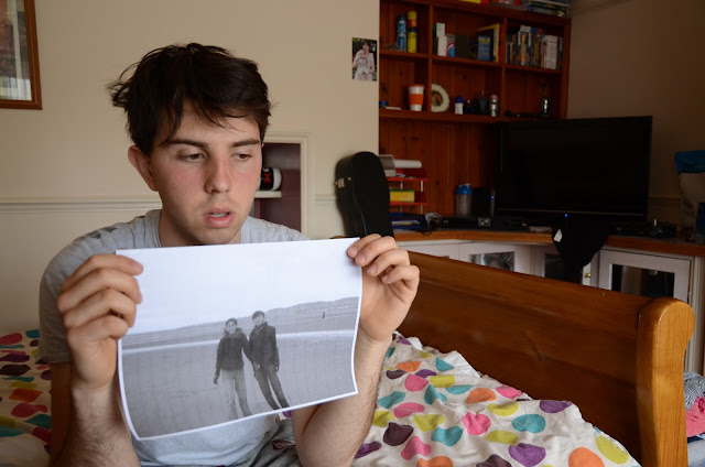
I like how in a lot of these photo's my boyfriend doesn't make eye contact with the camera. It shows that he is really deep in thought with regards the memory of a bad point in his life, in which he lost a lot of weight due to depression, and became anemic. The fact that his photograph is a black and white print-out reflects the fact that he didn't even have a physical copy of this photograph as it was such a distressing time of his life that bought back bad memories. Although not outwardly sad, it is possible to see little nuances of emotion in his face. As I have mentioned, I now aim to use two photographs of each of my subjects. One as a close-up and one that is contextualised amongst their personal sphere. In this sense I feel this photograph is lacking as the context-based elements are somewhat cut out as it stands somewhere between a closeup and a midshot.


I like this photograph as a close-up in terms of emotion. My boyfriend looks uncomfortable about answering my question and nervously scratches his head whilst looking downwards. 


I like this shot again as my boyfriend shields his face and looks rather uncomfortable. Clearly I underexposed the photograph, but this can be fixed easily in cameraRAW edit. Again, I wish I had taken it slightly further back to include the photographs beyond. The reason why I feel this is important is because it serves to support his story. His sister looks over him on the right hand side (the same one who is in the photo) almost like a guardian, and the symbolic Serbian depiction of st. George (my boyfriend is Serbian and his name is Djordje [translated as George in English])  struggles to sleigh the dragon, which represents Djordje's struggles at this point in his life. Djordje believes that this depiction of st. George - which he has had on every wall of every bedroom throughout his life - brings him good luck health wise, as his family was told by a Serbian doctor when he was ill as a baby, that the symbol of st.George would protect him if he kept it near him constantly. This therefore reflects his cultural beliefs and superstitions and is integral to his nature, and so is something that I really want to include in this photograph. This has also given me and idea for the caption of the contextual photograph: Djordje and the dragon.

I like the photo above as Djordje shields his mouth and therefore his expression is hard to decipher. It must communicate based on the viewers assumptions and ideas. I regret not using a tripod in this photoshoot and Djordje's bedroom has many lines, which highlight the apparent wonkiness and level of the camera, however, during a tutorial in class I now know that I can edit the distortion and rotation/horizontal elements of the photo and so should be able to correct these mistakes.


This is perhaps my favourite photograph of the collection as I really like the expression of Djordje's face mixed with the background elements that serve to make him him. The vivid colours of the duvet and bric a brac in the background contrast with the solemn facial expression and grey tone of the photo/Djordje's clothing. I also think that in terms of positioning this is the best example, as the photograph can be seen clearly and there is a symmetry to the room. The parralel lines of the bed invite the viewers into Djordje's personal sphere. However, the use of the flash in this photograph causes it to be somewhat fluorescent and overexposed and so I will have to correct this in editing.


Overall I am confident that I have some good shots that I can work well with in terms of editing.


Sunday, 14 April 2013

Technical Experimentation in Editing and Shooting - Week 12

During this Friday's lesson we learned how to shoot in RAW files meaning that the photographs we take will not be compressed and averaged out (in terms of lighting/exposure/colour etc.) to form a Jpeg. We took some photographs in this format and used the editing programme CameraRAW to edit our photographs to a much better standard than we could have done on photoshop alone. 


I took this photograph during the lesson when we were experimenting with raw files and editing them. As we can see from the histogram in the top left, which portrays a visual representation of the tonal value (colours and tones) in the photograph, there is a large peak in the middle. If the tones are out of range the image is likely to be over or underexposed. In the photo below I have turned the right clipper on (press keyboard button 'O') to highlight overexposed areas in the photo in red. As we can see the lights are very over exposed. I had to turn the exposure, temperature and highlight settings down and the shadows up to achieve the more balanced photo beneath. You can do the same for shadows by turning the left clipper on (press keyboard button 'U') (press both 'U' and 'O' at same time to turn off)


By clicking alt+ dragging the sliders I am able to explicitly see in the photo which areas are overexposed or highlighted (I pushed the exposure up in the case of the photo below to give a better visual representation) The areas in white are the parts which need most attention in terms of editing exposure.


To learn about using histograms in cameraRAW I watched the following tutorial:


Wednesday, 10 April 2013

Technical Tips and a Photoshop tutorial - Week 11

The following bullet points are tips and information shared during this weeks lessons which I have noted down:


  • Change the spot meter setting (shown below on the D7000 top screen) to one with a small dot for portraiture photography to focus on a mid-grey surface and to get the best exposure.


  • 5 is Mid grey on "The Zone System" exposure scale. To get a white/whited-out background for portraits use zone 8 or 9. 
  • Green Grass is a mid grey - remember if shooting outside so that the sky isn't too over exposed and bleached out, causing a lack of detail. 
  • Work out how far away your skin is from mid grey or carry a mid-grey card with you also to that you have the right exposure value. 
  • Camera raw edits raw files non destructively. Always set your camera to shoot in RAW to get the highest quality photo's which aren't compressed.
  • If you edit on Jpegs in PhotoShop, get used to using layers to edit non destructively. 
  • You can straighten lines in buildings to make it look more realistic as the D7000 tends to curve lines, or alter perspective to make photographs appear less realistic. You can use rulers on the screen to adhere to the blue guidelines. 
  • Command 'T' for free transform. 
  • Can put different effects such as brightness/contrast/saturation etc. into new layers to be non destructive using the adjustment pallette.
  • To duplicate layer drag layer to blank page symbol at bottom of layer section.
  • You can take parts of the photo to cover up other sections that you wish to eliminate.
  • Magnetic collection picks up on contrast and similar tones. 
  • Select something go to layer and press copy to layer - it copies what you selected to a new layer. 
  • Control Z = undo. 
  • Using the clone stamp tool: Choose size of brush, alter the opacity and flow. Hold down alt and click an area to paint from. (make sure you're on the correct layer) 
  • Save as tiff for final photo to print from as it is highest quality (jpeg compresses quality)
  • Check out patch content aware tool. Is quickest form of removing parts of the image/photograph, if you know how to use it well enough. 
I have watched this tutorial and experimented with the patch content aware tool in CS6:

I have previously used content aware before when aiming to create an idea of a faceless photograph of myself and my boyfriend. I also used it to eliminate the glare on the photograph that my mum holds up to the camera:


As you can see the left photo has a slight glare on the right which I have selected using the selection tool which gave me a rough content aware replacement. I then used my patch tool to make it fit better and look more realistic. The results can be seen in the photo on the right. There looks like there is a slight smudge from the photo onto my mums neck but that is a strand of hair.

Using the following tutorial, I created a blended image. I have used gradient masks and blends before when attempting tilt shift photography...


This is the image I created when following this tutorial:


I blended rich golden corn with dry/dying pond plants to symbolise life and death simultaneously.

Friday, 5 April 2013

Discussion with Tutor about idea

Upon talking to my tutor, Paul, about my new project idea, we decided together that it would be a good idea to include some context/background within the photograph. The reality of the background gives weight to the emotion felt or the expression represented into the photograph by making it seem natural unstaged and real. I aimed to show more of the persons world and personal sphere, thereby contextualising them against their own possessions and life. However, I am still also providing close-ups with less contextual information to really hone in on their expression and thus their reliving of the memory. Both of these types of photographs still portray elements of the Portraiture discourse such as pose, background, expression and clothing (David Bate, Photography: The Key Concepts) but also now ties in with the work of Nan Goldin and Tina Barney who depicted their close friends and family in their environments, whilst still alluding to the project Dear Photograph and the reenactment of memories referred to by Irina Werning in her photography, as well as Newsha Tavakolian from the Light From the Middle East: New Photography exhibition at the V&A, and Eolo Perido, whose work I stumbled across on the website 500px.

My Inspirations


Sunday, 24 March 2013

1st Portraiture Photo Shoot


This evening I took some photographs of my mum who is retelling me the story of giving birth to my brother. It was a stressful time as my brother went into distress and my mother felt very ill, however in the photo's immediately afterwards she is shown smiling with my dad into the camera in one, and alone holding my brother in the other. I booked out the Nikon D7000 and a flash gun, and considered booking out a portable lighting kit, but decided against this as I did not wish to make the whole process to formal. I wanted my mum to really get into describing the truth of her memories. Here are some unedited photo's from the shoot:


I asked my mum to hold the photographs up at face level and then asked her questions about the traumatic experience. I have heard snippets of this story before and so partly knew what to expect. My mum described the ordeal as an "out of body experience" and said she was terrified as many surgeons entered the room in scrubs and were rushing around. I am not fully happy with the positioning of this photo. My idea was to take from further back, to incorporate some contextual background, however I wanted to keep the camera level and so placed in on the table, but certain objects got in the way. I should have perhaps gotten out a tripod.
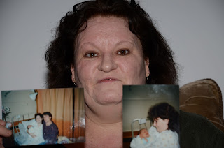


I like this photo as it is quite comical, due to the moment at which it has been captured and the presumption that my mum is about to swear, which she did when describing the pain. However, the positioning of this photograph is all wrong as I have cut off her head and the photographs. I wanted the photo's to be slightly blurrier to highlight the importance of the current emotion, but was frustrated by the slight glare on these photo's and by the lighting of the room in general as it wasn't very dramatic.


I experimented by turning on a lamp to the side of my mum and placing a white polystyrene surface next to her to counteract the amount of light from the key light. The white wall in the background acted as a "backlight" of sorts, thus creating an albeit simplistic 3 point lighting system. However the light was quite orange as you can see from the photo's below.


In this photograph I tried to effect dramatic lighting by dimming the lights and using the full light the key light. As you can tell it wasn't the best idea as the photographs are not visible and the shadows are very over the top.
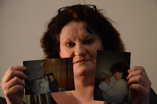


I like the expression of my mum's face in the 2 photographs above as they are subtle and not over the top as some of the others are in this series. I feel they sum up the story my mum has relayed to me well. The things I do not like are the dark lighting and the fact that the focus has shifted to my mums hands holding the photographs rather than her face, whereas I wanted her face to be in focus as it symbolises the reality over the false.


Out of all of the photographs that I took today, this is my favourite. It is a little to orange and
the photographs slightly glared/in the way, however, despite all of this my mum and I feel that her facial expression is the most concurrent with how she felt at the time. If you stare at it you can see bits of all different emotions. On the right hand side her mouth curves up slightly portraying a half smile where as on the other side it curves down. Her eyes, although somewhat engaging with the viewer, seem to look past us into a different time or memory. I think it is one of the more visually complex photographs of the series and have used photoshop to edit it in different ways to make it even more so. Here are a few examples:


In this photograph I have muted the colours in terms of vibrance and saturation. I have also heightened the shadows to give the photo slightly more light, as well as to bring out the detail and lines in my mothers skin which I find really interesting. I have also altered the clarity and contrast to make the photo sharper and darker.


I personally prefer this version better as the orange lighting has been eliminated and thus I think it is more aesthetically pleasing. I also like how it could come across as more truthful as this aesthetic is synonymous with truth, evidence and reality.


______________________________________________________________________________________________

Update: 26/04/2013

I was not aware of the different types of shooting until recently and unfortunately did not shoot these photo's in camera RAW and so they are compressed lower quality images that they should be. Since then I have been photographing in RAW uncompressed files and have been attaining higher quality photographs. However, I am still drawn to the photograph which I have chosen in this section and hope to use edit it effectively and use it in my project.