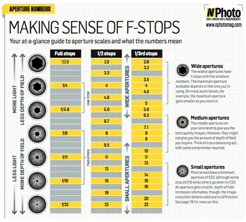
Today, during the introductory lesson to Photography, I refreshed my knowledge on the NikonD7000. I learned particularly about F Stops, Aperture, Shutter Speed, ISO, and D.O.F (Depth of Field) and how these work in relation to eachother. The following diagrams and tutorials helped me to comprehend the science behind these:
I like to think of the aperture as the pupil of an eye shrinking when the light intensity is strong, and widening in darker settings, in order to let more light in. This enables me to comprehend shutter speed, as I think of it as an eye blinking, and so when the pupil (aperture) is wide open, the blinking speed (shutter speed) should be faster, so as to let less light, and vice versa.

During this lesson we were also set a task to create abstract photographs of the new Jubilee building; and thus we had to shoot close-up images of certain aspects of the building that, when viewed as a collection afterwards, reflected its atmosphere and gave an insight into it. Here are a few examples of the photo's I took:
This was the first photograph I took inside the building and I chose to focus on this element as I associate this building in particular with metal materials, chrome colours and interesting patterns; all of which I felt were embodied in this particular image. I realise that this image is slightly out of focus and, were I to shoot it again, I would perhaps construct the image better by cropping out the background below and perhaps shifting the mesh material to the right of the screen, and showing more of the plain metal to the right, as this would highlight the contrast between the sleek smooth metal and the artistic patterned metal.
I chose to photograph this feature wall for similar reasons to the image above; as the bright colours inject warmth and personality into the building. Were I to take this photo again, I would shift the focus from the second square to the first, and decrease the depth of field so that this square is the only thing in focus and as the eye is drawn further to the left of the photo, the other squares are somewhat blurred. I would also not cut out the the corners of the first square as I feel this would be more aesthetically pleasing.
I particularly like the subtlety of the spot-lighting in this photo and the crispness of the lines, however I feel this image does not fit the brief as succinctly as the others as it is a bit too far back, and would benefit from being cropped.
Week 2
Today, when displaying the results of the previous weeks exercise to one another, and describing our motives and thoughts behind our work, we came across Tilt Shift Photography. This style requires a small D.O.F, and is used to make things appear smaller than they are in reality. The effectiveness of a photograph adopting this style is usually heavily reliant upon its editing in the post-production stages e.g. intensifying the blur of the out-of-focus aspects, and the increasing of saturation to highlight the miniature/toy like styl e of the image. There is also a 'miniature option' on the Nikon D7000 which can help to achieve this style.
The following are examples of tilt-shift photography:
This style of photography gave me the idea to perhaps focus on important and popular landscapes in London and document these in this particular style. I thought that I may then edit a hand into the image, either painting, gluing, stitching etc. as if this hand had created the landscape. I want this to metaphorically highlight the extent to which a photographer constructs an image, and also wish to ameliorate the importance of these landscapes; thus questioning certain power structures (i.e. a tilt-shift depiction of the house of commons, important financial structures such as gherkin/canary wharf) However, I also toyed with photographing religious buildings such as Church's, Cathedral's, Mosque's etc. and applying the same concept. The obvious problem with this idea would be the accessibility of attaining these photographs from such a high-angle.
I watched this video to gain a greater understanding of tilt shift photography
http://vimeo.com/27359051
This example is from a photo I took. I feel it is not as effective as the angle is not high enough and therefore it is not effective in appearing as a miniature landscape.


.jpeg)


No comments:
Post a Comment